top of page
During my time taking the course titled “The Design of Everyday Things” at the University of California San Diego, I collaborated on a group project to redesign a feature within Apple’s Clock app, the alarms tab.
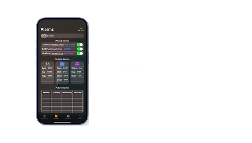
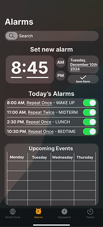
Final Redesign
In our group research, we realized that many users struggled with different aspects of the alarm clock including organization, deletion of alarms, and adjustments of volume and sound. We decided to implement all these aspects into our new redesign so that we would not only make the app have a wider range of usability while keeping the complexity of the app relatively simple, but also enhance the minimalistic aesthetic that blends into apple’s current software.
I contributed to 20% of the user interviews and question brainstorming process. The Figma prototypes and design space charts were completed on my own with assistance from analysis that other group members created from the interview responses. All visuals shown from this project were created by myself.

User Research
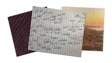
Our questions were designed to help us understand the strengths, affordances, and limitations of setting alarms on the clock app. Some of the questions include:
-
How many alarms do you have set for everyday use (on average)?
-
How often do you need to delete multiple alarms in one session?
-
How important is the ability to customize alarm sounds to you?
In order to further understand the user experience, I also asked questions about the user’s procedure when interacting with the app and desired features such as:
-
Can you walk me through how you set an alarm?
-
What happens when you need to adjust or delete alarms? How does that process work for you?
-
Can you imagine a scenario where your alarm needs are different for specific days? How would you want that to work?
The interview process concluded with simple survey-like ratings of app complexity, aesthetics, etc. to help our group define the trade-offs between different app features. The master-apprentice model was utilized to gain more insightful answers, and to assist in avoiding leading questions during these interviews.
-
50% prefer to adjust an existing alarm in the Other tab while the other 50% prefer creating a new alarm altogether
-
Add the ability to schedule alarms for certain dates
-
Enhanced customization for alarms and volume control
-
55% feel the app’s alarm organization is cluttered and lacks more filtering or grouping options.
-
Add a grouping alarms feature (integration within the existing Apple ecosystem is a bonus)
-
50% are dissatisfied with the process of adjusting the volume and sound on their alarms
-
Streamline the alarm deletion and adjustment process
Problems We Identified:
Some of Our Project Goals:
Prototype Thought Process
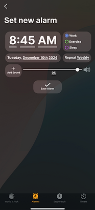
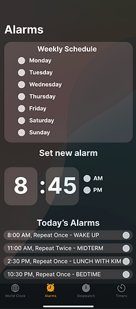
One of the features from my prototypes created for the group project include a new search bar that is intended to filter through the list of alarms. The placeholder “Search” as well as the magnifying glass icon signifies that the users can click here for this new functionality. It also includes a new design for setting new alarms with enhanced customization.
- 72% of users expressed interest in a scheduled alarm for a day farther out into the future. In order to help users feel more confident in their future events or tasks being remembered, our group decided to incorporate an option for a new scheduled date alarm under the time.
- 55% percent of users set alarms for task management and expressed the pain point of the lack of groupings or customization for task types. To alleviate this problem, a section specifically for task type was incorporated through a second page connected to the “Set new alarm” button at the top of the home screen.
The clock app with these new reimagined customization features allows users to feel more confident in their ability to plan out future events and alleviate their need to keep event and planning information stored in their heads. Users now have the ability to adjust the volume of each new alarm as well as upload custom alarm sounds.
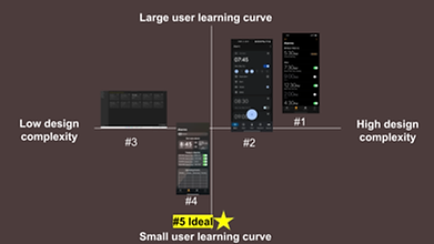
Comparisons to Existing Designs
When determining a starting point for a redesign, I consulted other common alarm programs that people use, such as competitor apps from google and microsoft. Using the information given, I compared the differences in each app by building charts that rate each program in relation to trade-offs that apply to all of them. Some of the apps that I compared on design space charts are:
1. Apple Clock App
2. Google Clock App
3. Windows Clock App
4. Our Redesign
5. The "ideal design"
Each of these apps have their own unique affordances and signifiers, which influenced the placement that I gave each app. The axes were created to compare different tradeoffs that might be experienced when considering different design features/aspects

Reflection
Throughout my studies in university and involvement in pre-professional clubs related to UX/UI and product design, I have been a collaborator for many group projects (with most of my contributions having a focus on the redesign, visuals, and analysis of collected data). This project was one of my favorites because of the way it required me to use software such as Figma and the Adobe Creative Suite in a group setting. There were many alterations to the redesign and analysis throughout online video calls and in-person work sessions, all which improved my ability to contribute to a project within a group collaboration setting. This project was a great test of my design abilities within a restricted timeframe of about 3 weeks.
bottom of page